Visualizations#
Creating common figures is easy with py-smps. There are two primary out-of-the-box figures that can be made: the histogram (smps.plots.histplot) and the heatmap (smps.plots.heatmap), often referred to as a ‘banana plot’.
All of the plotting functionality is made using matplotlib, so you can easily modify or extend them using common syntax and additional libraries such as seaborn.
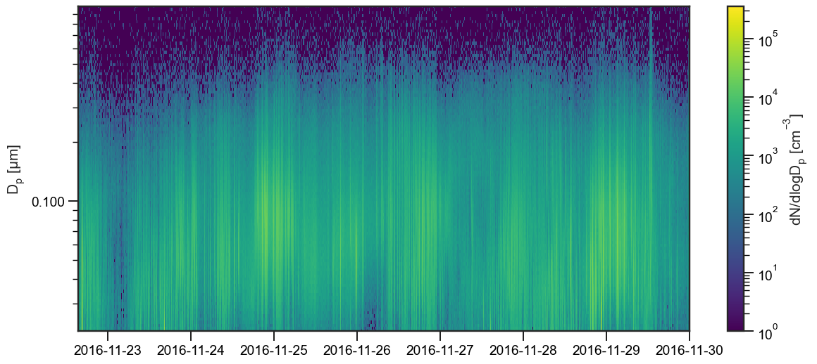
The Heatmap#
The heatmap function makes it easy to visualize how the particle size distribution is changing over time, allowing you to observe growth/nucleation events, etc. To use the heatmap function, you must provide three arguments:
X: the time axisY: the bin midpointsZ: the data you wish to plot, typicallydN/dlogDp
You may not agree with the default colormap choice (viridis), but you can easily change it as you see fit. However, you can’t use ``jet` <http://jakevdp.github.io/blog/2014/10/16/how-bad-is-your-colormap/>`__!
[2]:
import smps
import warnings
import pandas as pd
import seaborn as sns
import matplotlib.pyplot as plt
import matplotlib as mpl

sns.set('notebook', style='ticks', font_scale=1.25, palette='colorblind')

warnings.simplefilter(action='ignore', category=FutureWarning)

# Set the default smps visuals
smps.set()
We will use the same example dataset (“boston”) that we’ve used throughout the rest of this tutorial.
[3]:
# Load the sample boston data
obj = smps.io.load_sample("boston")

X = obj.dndlogdp.index
Y = obj.midpoints
Z = obj.dndlogdp.T.values

# Plot the data
ax = smps.plots.heatmap(
    X, Y, Z,
    cmap='viridis',
    fig_kws=dict(figsize=(14, 6))
)
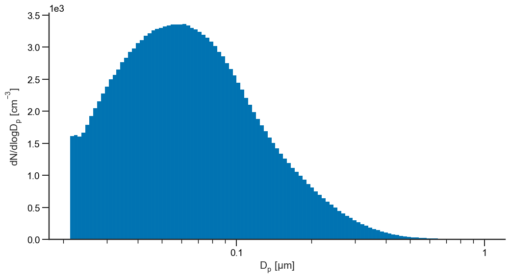
The Particle Size Distribution (PSD)#
To visualize the particle size distribution, use the histplot function. To plot the histogram, you must provide two pieces of information:
a histogram, provided as either an array or a dataframe (which will be averaged to an array)
the bins
There are plenty of ways to customize these plots by providing the keyword arguments for the matplotlib bar chart using the kwarg plot_kws or the figure itself using the kwarg fig_kws. You can also plot onto an existing figure by providing the axis as an argument.
Here, we make a simple plot showing the same boston dataset:
[4]:
ax = smps.plots.histplot(
    obj.dndlogdp,
    obj.bins,
    plot_kws=dict(linewidth=0.01),
    fig_kws=dict(figsize=(12, 6))
)

# Fix the axis labels
ax.set_ylabel("$dN/dlogD_p \; [cm^{-3}]$")

sns.despine()
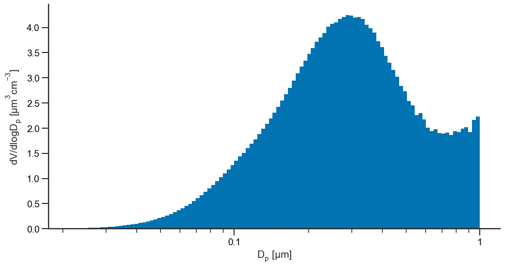
We can also plot in in volume-weighted space:
[5]:
ax = smps.plots.histplot(
    obj.dvdlogdp,
    obj.bins,
    plot_kws=dict(linewidth=0.01),
    fig_kws=dict(figsize=(12, 6))
)

# Fix the axis labels
ax.set_ylabel("$dV/dlogD_p \; [µm^3cm^{-3}]$")

sns.despine()
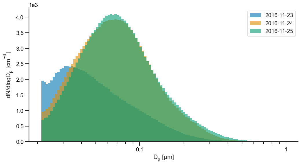
Next, let’s plot the same data, but plot the particle size distribution by day:
[6]:
import itertools

# Create a list of dates to plot
dates = ["2016-11-23", "2016-11-24", "2016-11-25"]

ax = None
cp = itertools.cycle(sns.color_palette())

for date in dates:
    ax = smps.plots.histplot(
        obj.dndlogdp[date],
        obj.bins,
        ax=ax,
        plot_kws=dict(alpha=0.6, color=next(cp), linewidth=0.),
        fig_kws=dict(figsize=(12, 6))
    )

# Add a legend
ax.legend(dates, loc='best')

# Set the axis label
ax.set_ylabel("$dN/dlogD_p \; [cm^{-3}]$")

sns.despine()